Three ways to draw ninety days.
The agent roadmap is the ninety-day track as a single shareable page: 33 items in four phases, the Academy modules each phase opens, and a day you can drag to. The version that shipped this week is one reading of it. These are three others, each built as a working page on the same data, so you can move the slider on each and decide which one Signature should hand to a new agent.
The shipped version, for comparison: signature-business-planner.pages.dev/roadmap
A, The Ledger, for the page Signature shares. It reads once, in order, and prints. B belongs on a screen in the room on orientation day. C is the app's own view and should live there, not on a second page.
All three keep the same data, the same day control and the same owner filter. What changes is the register and how much the reader has to operate.
How it works
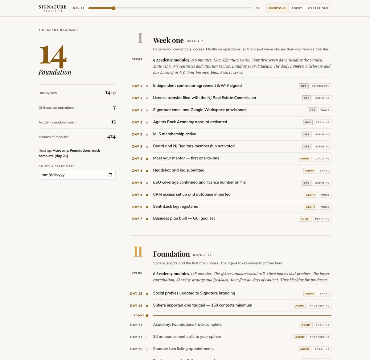
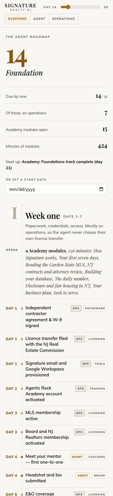
One column, ninety days top to bottom. Roman numerals mark the four phases, and each phase opens with an italic line naming the Academy modules it unlocks. A rule marked "today" slides down the ledger as you move the day, and everything below it is the future.
Best for
Sending to a new agent before day one. Leadership reading it in one pass. Printing it, because a ledger loses nothing on paper.
Watch out
There is no way to look at one phase alone. On a phone it is long, with 33 rows plus the module lines, though the sticky top bar keeps the day within reach.
How it works
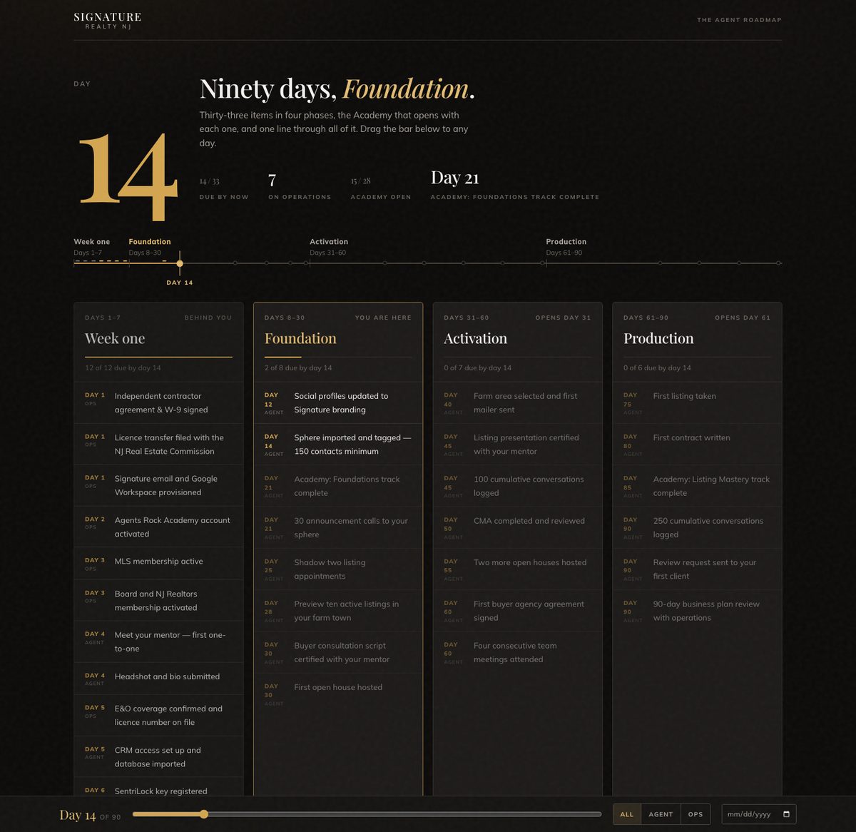
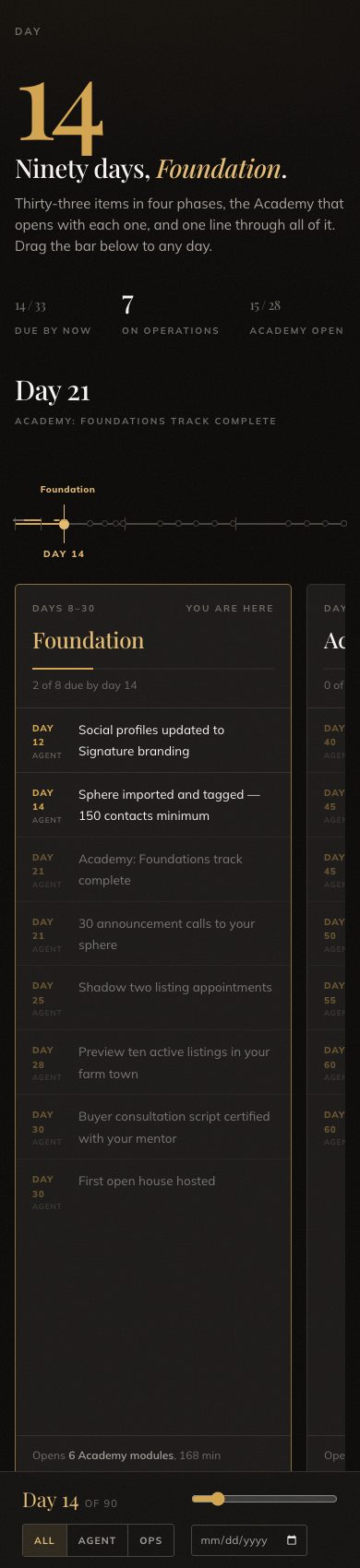
One big number, then a line across the full width with a dot for every item. The line lights up as far as today. Below it the four phases sit side by side as cards, and the controls live in a fixed bar at the bottom, like a player. Clicking a dot on the line opens that item in its card.
Best for
Orientation day on the office screen. A listing-presentation register. The Evening skin of the app, which already uses these tokens.
Watch out
Dark reads badly printed and in a bright office. The four cards want a wide screen. On a phone they become a swipe deck, which works but hides three phases at a time.
How it works
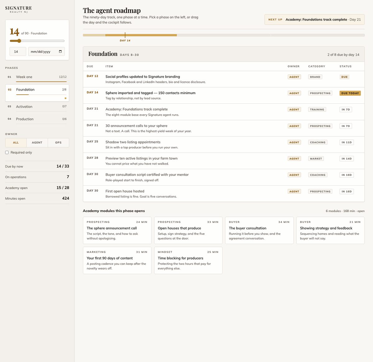
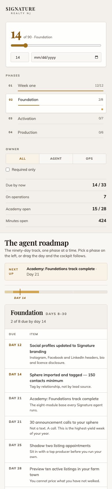
Every control lives in the sidebar: the day dial with a typed day and a start date, the four phases with their progress, the owner filter, a required-only switch and the four facts. The main pane shows one phase at a time as a table with a status column reading due, due today, or in so many days. Drag the day and the pane follows; pick a phase and it stays.
Best for
Operations checking one phase against one agent. Anyone who wants to filter before they read.
Watch out
It is close to what the in-app onboarding screen already does, so as a public page it stops adding a different view. The table scrolls sideways on a phone.
Side by side
| A · The Ledger | B · Evening Board | C · The Cockpit | |
|---|---|---|---|
| Register | Daylight, editorial | Evening, presentation | Daylight, application |
| Reads as | A programme you read once | A board you look at | A panel you operate |
| Primary control | Slider in the sticky top bar | Slider in a fixed bottom bar | Day dial in the sidebar |
| Phases | All four in sequence | All four side by side | One at a time |
| Filters | Owner | Owner | Owner and required only |
| On a phone | One long scroll, controls stay at the top | Swipe deck of phase cards | Sidebar stacks, table scrolls sideways |
| Prints | Well | Poorly | Adequately |
| Closest to | A printed handbook | The app's Evening skin | The app's onboarding screen |
The call
Go with A for the shared page. The roadmap's job is to be read in order and handed on, and the ledger does exactly that with the least to operate. The app already owns the operable view, and after this week's rebuild of the onboarding screen it does it well.
Take B's line and numeral if the roadmap goes on a screen. The lit line with a dot per item is the strongest single element across the three, and it belongs in the room on orientation day. It can also become the rail on the app's Evening skin without a redesign.
If C wins anyway, fold its phase tabs and status column into the operations view of the app rather than keeping a second page that does the same thing.
- Pick a direction, or a pairing such as A for sharing and B for the room.
- Confirm the 33 items and the four phase names, since every direction prints them as the standard.
- The chosen page replaces the current one at the same address, so any link already sent keeps working.